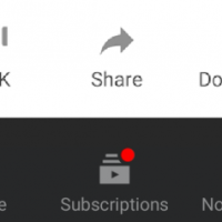
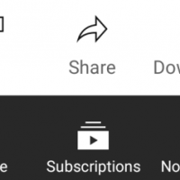
YouTube has slowly been rolling out a new icon style which is both thinner and sharper. First discovered was this new style back in the summer and end of 2020 on both Android and iOS. This was the first major icon overhaul since Google updated to the new Material Design icons in 2017.

Departure from Material Design
These new icons might seem like quite a departure from Google’s established “Material Design” design language, putting a focus on having a thinner, more elegant style. This might be a way for YouTube to distinguish between Android and it’s own brand.
Before the new icons appeared, the company had first tested showing a new “create” button on mobile in favour of the old notifications. Following, this A/B test must have proven successful, opening the way to introduce a completely new icon style.
The change is definitely something you might need to get used to, as it’s a departure from the familiar Material Design. Personally I am not too sure why YouTube has introduced this change.
New YouTube icons not accessible?
As a fan of accessibility, I feel like these new “line” icons lack contrast and are harder to recognise. This might make the website less accessible for a majority of the web users.
For example, when viewing the comment section of a video. The “thumbs up/down” icon is barely visible both on dark and light mode, due to a lack of contrast between the background colour and icon. For a vision impaired user, or even a high contrast screen, these icons are not accessible at all.

Final thoughts?
What do you think of the new line icon style on the YouTube website and app? Let us know in the comments below!


Conversation
We are glad you have chosen to leave a comment. Have fun, be respectful to others, and don't spam.